Identify relevant Event Trends in seconds


Instantly view Event Trends relevant to your business
Daily Event Impact is one of our most popular tools, as it allows you to quickly visualize patterns in demand, including demand surges caused by overlapping events within close proximity, and periods of lower demand. This month, we’ve updated this feature to be called “Event Trends” and we’ve given the page a sleek new visual design that makes it easier to navigate.
Businesses use Event Trends to identify spikes and dips in demand. Below are some examples of how different types of companies use the feature, and what actions they take because of it:
If you are an accommodation manager, you may see upcoming spikes in demand and roster on more staff, change your marketing, or adjust your room prices to match.
If you manage parking garages, you may look at upcoming demand from events, or the absence of events, to optimize parking pricing for busier or quieter periods.
For restaurants, you may want to adjust your staffing or inventory levels to ensure your team is prepared for event-driven peaks in demand.
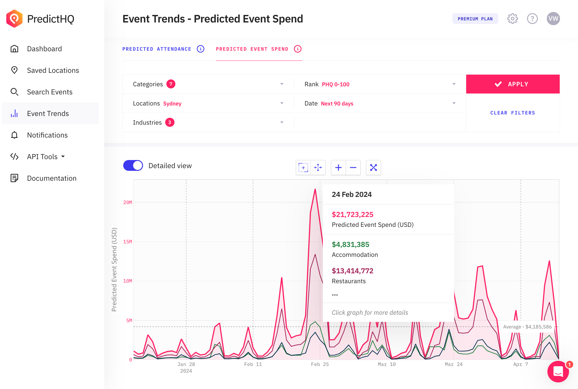
Event Trends allows you to see the patterns in demand at a glance, and see the future demand for the next weeks, months, or even a year. Our unique Predicted Attendance feature uses advanced machine learning models to predict how many people will attend an event before it happens, which allows you to take action and make sure your business is prepared. You can also see aggregate Predicted Event Spend to understand patterns in the economic impact from events.
Event Trends instantly shows you which days will be most impactful at a glance, and you can then explore the granular details of each event driving these trends. Let’s dive into the details of what’s new and how you can use this feature to unlock important insights.
See top events and aggregated attendance data per day
Event Trends aggregates the total Predicted Attendance and Predicted Event Spend for all events occurring in key locations on any given day. This way, you can quickly visualize key dates when local spending will be the highest and adjust staffing, inventory, and marketing in advance to tap into event-based consumer spending.
To use Event Trends, simply choose a location and set your filters, then click "Apply". The graph will then be populated with data that shows you when event attendance is highest. In the Predicted Attendance tab, the graph shows the total daily attendance for all events that fall within the selected location.
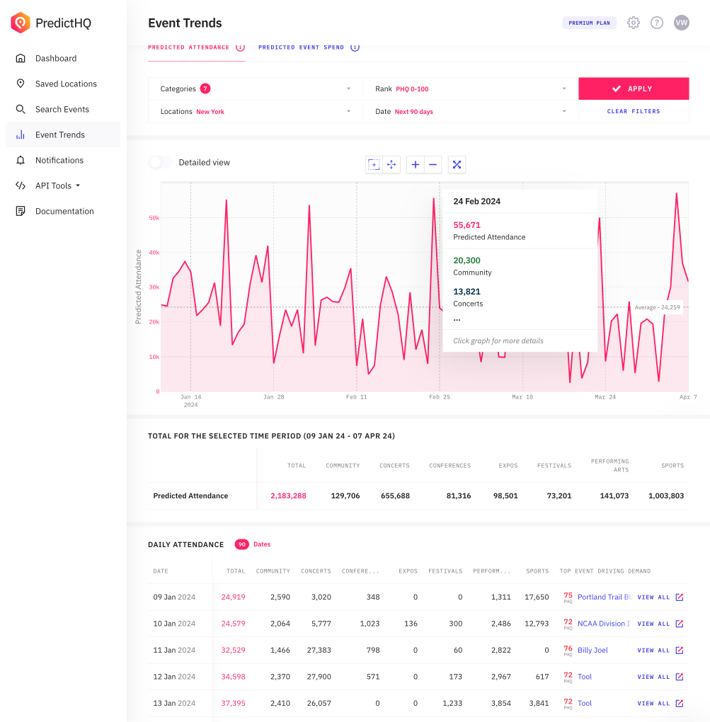
Use the new table format to see total statistics at the very top, as well as statistics per day. Get a quick snapshot of the top event of the day along with links to additional events. Enhanced interactivity also allows you to click on the graph to view details about top events on any given day. Plus, you can zoom in and out on the graph for a more detailed view.
Stay tuned: Soon, we’ll also be adding more sorting options in the table view, and the ability to create notifications for upcoming demand surges directly from the graph.
Where to find Event Trends in our platform
Find Event trends within our web application Control Center. If you have a demand forecast or BI tool that you use to visualize demand, you can also access Event Trends data, such as aggregated Predicted Attendance figures, by using our API to integrate this data.
Get to know the API behind Event Trends
For our data scientists and more technical users, let’s connect the dots on how this feature in Control Center is built. Event Trends are graphs and visualizations within Control Center that are powered by our Features API which aggregates and summarizes PredictHQ’s data.
The data in the graph is generated by calling the Features API for the selected time period, and adding together the data returned per day for a number of different features. You can get this data in your own application by using the Features API yourself. This API is a great way to integrate new machine learning features into your forecast, or to get summary statistics.
For example, to show the aggregated attendance per day for the Predicted Attendance part of the graph in Control Center, we sum together all the PHQ Attendance features for the 7 attendance-based categories, which are:
hq_attendance_community
phq_attendance_concerts
phq_attendance_conferences
phq_attendance_expos
phq_attendance_festivalsphq_attendance_performing_arts
phq_attendance_sports.
The same applies for how we aggregate Predicted Event Spend. These features returned by the Features API are designed to be used in machine learning models. Check out our Feature Engineering Guide to learn more.
Log in to explore Event Trends now, and stay tuned for more exciting enhancements as we continue to innovate and improve our services.


