Viewing the Time Series Impact Analysis in Demand Analysis (Beam)
Once these checks are done, and the data set has been accepted, Beam uses the data set provided and the event impact during that time period within the radius selected around the center point, to find the correlation between demand and events.
During the analysis, Beam uses proprietary machine learning algorithms to efficiently decompose the demand data time series into three major components:
Seasonal - the pattern observed weekly/monthly according to your business. The demand would fluctuate up and down repeating the same behavior over time according to the periodicity. In general, this demand can be interpreted as the average demand to be expected on any day within that period without exceptional occasions.
Trend - describes the growth, or otherwise, that your business is experiencing over the long term. The fluctuations over a short period (seasonal) are of the same magnitude but the tendency of that fluctuation will shift according to the performance of the business. E.g. if the business has recently launched a new product that attracted more customers, growth will be recorded that is measured with the trend. If such growth persists, then the trend continues to increase.
Residuals - measure the unexpected demand (incremented or decremented) after removing the known factors of your business. Incremented demand can be explained by events happening on that day or 2 days later, whereas decremented demand is the effect caused by unprecedented events such as strikes, earthquakes, or global pandemics.
Beam’s intelligence is focused on two parts, to find these unexpected demands, and anomalies in the demand data, and to compare the demand with PredictHQ’s event impact to help explain the cause behind the demand. According to the research conducted in support of building Beam, it was identified that industries may experience a lead in demand before events. For this purpose, Beam shows the correlation between the business demand data on a day and the respective event impact on the same day, but also one and two days later. Guidance on how to decompose a time series using standard decomposition tools can be found within our data science guides.
At the end of the analysis, you can view the results that look like the screen below, with the interactive plot showing in the middle of the screen:
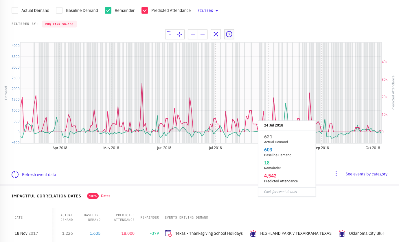
By default Beam displays the Demand (demand data uploaded), Incremental Demand (the demand that is higher than expected), and Event Impact. The peaks that correlate the demand data with event impact will overlap or the event impact peak will lead by around 2 days.
The left y-axis shows the demand scale related to the data uploaded, whereas the right axis displays the impact. This means that the y-axis shows either demand or incremental demand according to the filters selected (filters explained further below). Hovering over the graph gives you information on that current day, and you can select an area on the graph to zoom in accordingly. This will provide immediate insight into the correlation.
See also Using the Demand Analysis (Beam) graph and Getting more details on a date on the Demand Analysis (Beam) graph